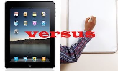
There’s an ongoing, ancient debate in the world of pitching: how high-tech or low-tech should a pitch be? Does it really matter? Does the audience really care?
At Voyage, we’ve worked on totally immersive pitches for clients like Ferrari World and Le Reve for Wynn Las Vegas that go way beyond the standard 2D deck. But that doesn’t mean they’re always high tech. Sometimes a smart person armed with a dry-erase pen and a white board is a lot more convincing than a highfalutin, hard-to-follow, complicated series of do-dads and wing-nuts…
So all this raises a big question:
How do I know which pitching platform works best for my concept?
We all know that technology is evolving at an exponentially faster rate than ever before. With the advent of hardware like the iPad and portable projectors (built into your cellphone!), it’s really easy to get bogged down by the infinite possibilities of where your presentation can go…
Do I go the interactive route? Something a client can touch and feel on an iPad, iPhone, or something else? Or do I create a deck, but make it larger than life and sexy?
Should I just pound insane amounts of caffeine or 5-Hour Energy’s and wing it?
According to the renowned Venture Hacks, the first and most important thing you need to identify is whether or not you’re dealing with a simple concept, or a high concept. Once you identify this, you’ll be able to tell which pitch route to go – the Lo-Fi route, or the Interactive.
Lo-Fi – If you have a high concept, this is the more humanistic way to go. You want to open up a conversation with your audience – they’re going to have a lot of questions, so plan on being interrupted! This could even be a case where the smart-guy-and-a-white-board is the best way to go – if you know your concept cover to cover and aren’t locked into any format, you’re able to revise your pitch on the fly. Additionally, if you’re presenting complex ideas, you’re able to involve your audience – if they see the ideas gradually building on one another (on a whiteboard) they clearly see how one idea builds upon another, and another, etc. You can also read your audience and tailor your spiel around their reactions – you want to gauge their emotions and play off of them. There’s also room here to create a simple image based presentation with minimal copy – you just pinpoint the broad strokes. The key with the Lo-Fi pitch is that it’s simple, relateable, and casual.
Interactive – It’s easy to get caught up in all the crazy features you can wield with an interactive presentation, especially with touch screen technology. Don’t get yourself into a black hole of too much tech though! Tech fatigue is a very real thing – like the Lo-Fi presentation, you still want to keep the pitch as simple as possible, and totally intuitive to boot. For instance, tell a visual story as opposed to overflowing the pitch with text – storytelling skills on a kinesthetic level will hook your audience! So as we’re all figuring out the capabilities of the iPad, microsites, and even highly stylized pitch books, it’s better to reserve the interactive platform for your simpler concepts. The reason: it’s easier to keep it casual.

I still haven’t had a chance to catch up with the rest of the pitch party pelpoe (I will, I promise, but today I had to find new glasses which is far less fun I ordered two pairs, spent far too much money, and long to be able to wear contacts again or to have my eyes lasered, but I’m too chicken for that): but meanwhile, have a look at the new Absolute Write Blogroll gizmo that I’ve added to the blog which should result in new hits for you all. It’s easy to get your blog added: just join AW, get obsessed, add the blogroll to your blog and request inclusion via the link provided.